

Raise the Roost Kiosk
A fast-track UX design project to create an intuitive self-service kiosk interface for a restaurant chain, with the added challenge of a tight timeline and transition between designers.
When our existing designer announced their departure, we found ourselves in a tight spot.
We needed to quickly develop a user-friendly kiosk interface that would streamline the ordering process while maintaining consistency with our design systems. The solution had to be modular, scalable, and implementable within a compressed timeframe.
I started by mapping out comprehensive user flows for the entire customer journey.
This included paths for standard menu ordering as well as custom flows for building meal combinations. By visualizing these journeys early on, we could identify potential friction points and design around them from the start.

Beginning of Basic Order Flow
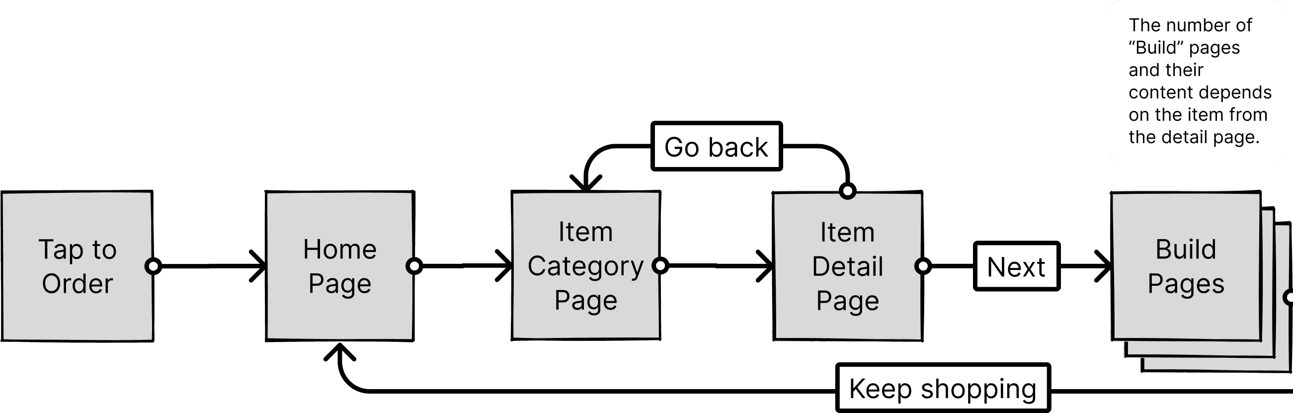
Beginning of Build Order Flow
Our team gathered for a workshop to analyze the competitive landscape.
We looked at what was already in the market, discussing what worked well and what didn't. Through this collaborative process, we identified pain points in competitor interfaces and documented successful patterns worth adapting.
The good
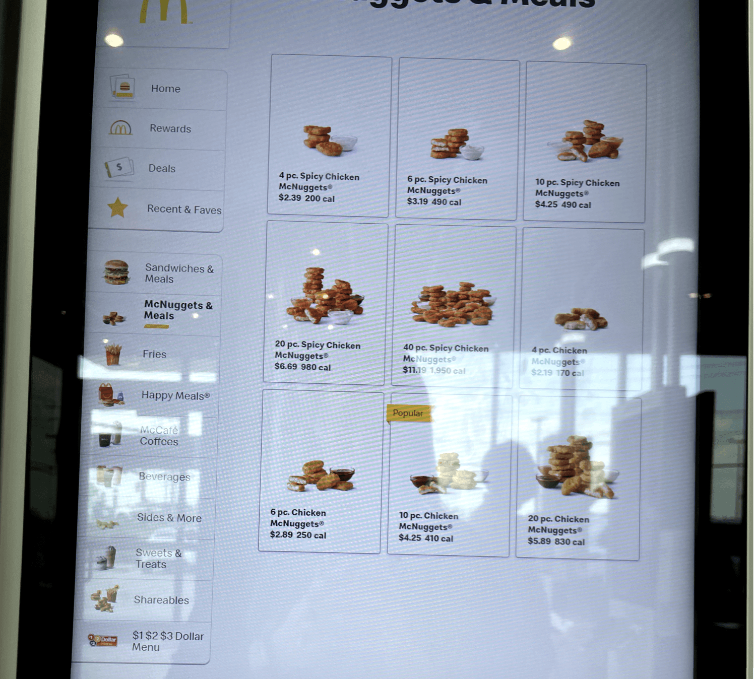
The bad

And the ugly
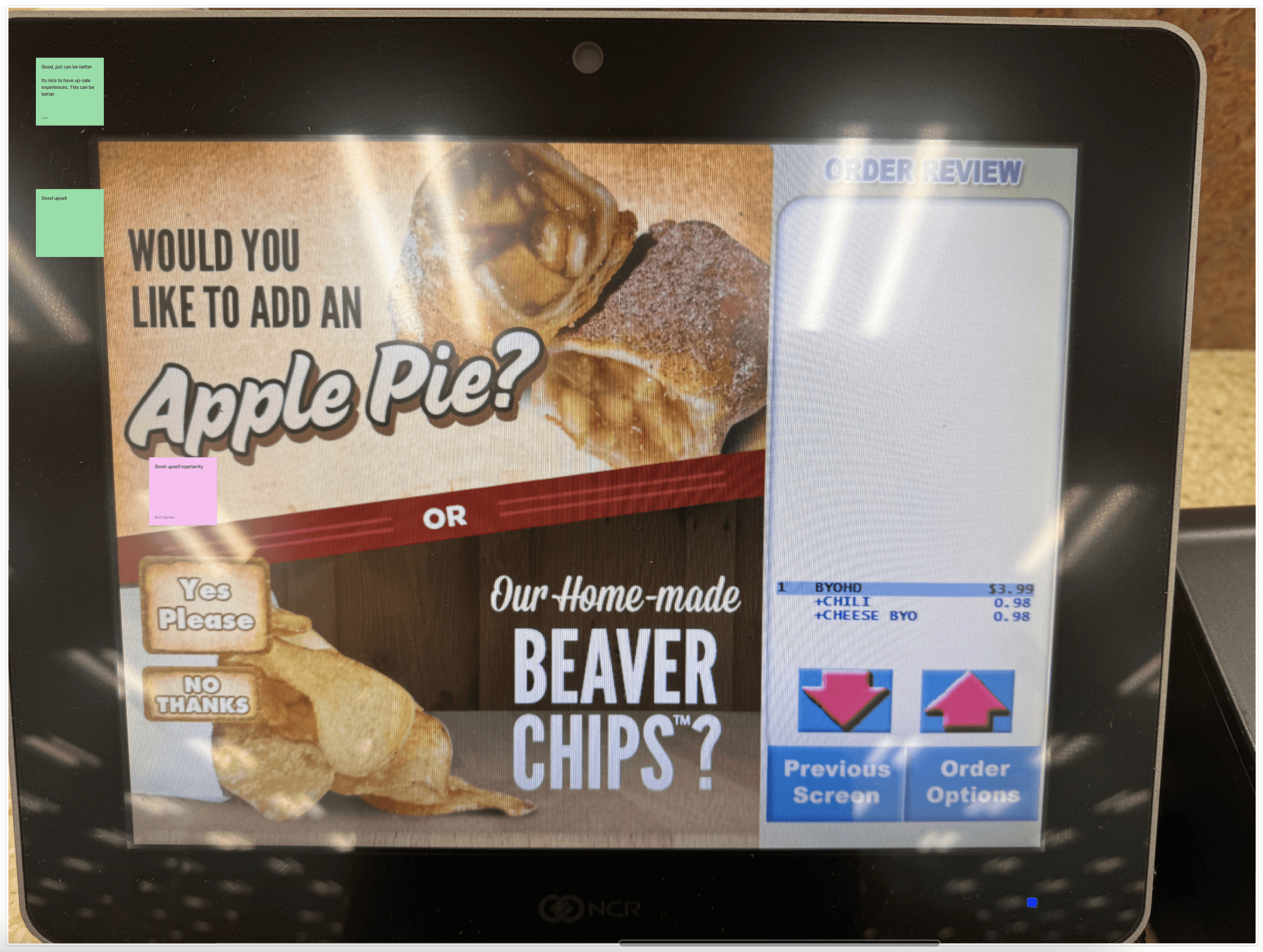
We gathered these findings to move forward
We spotted several opportunities for innovation where other kiosks were succeeding, and others were falling short. That led to a gameplan on how to deliver the best MVP in our short timeframe.
I think in systems, so the first thing I did was establish a flexible grid layout for the home screen.
This modular architecture was crucial because it accommodated varying numbers of promotions while allowing components to dynamically resize without losing visual consistency. When the marketing team needed to add seasonal promotions, the interface could adapt without requiring a full redesign.
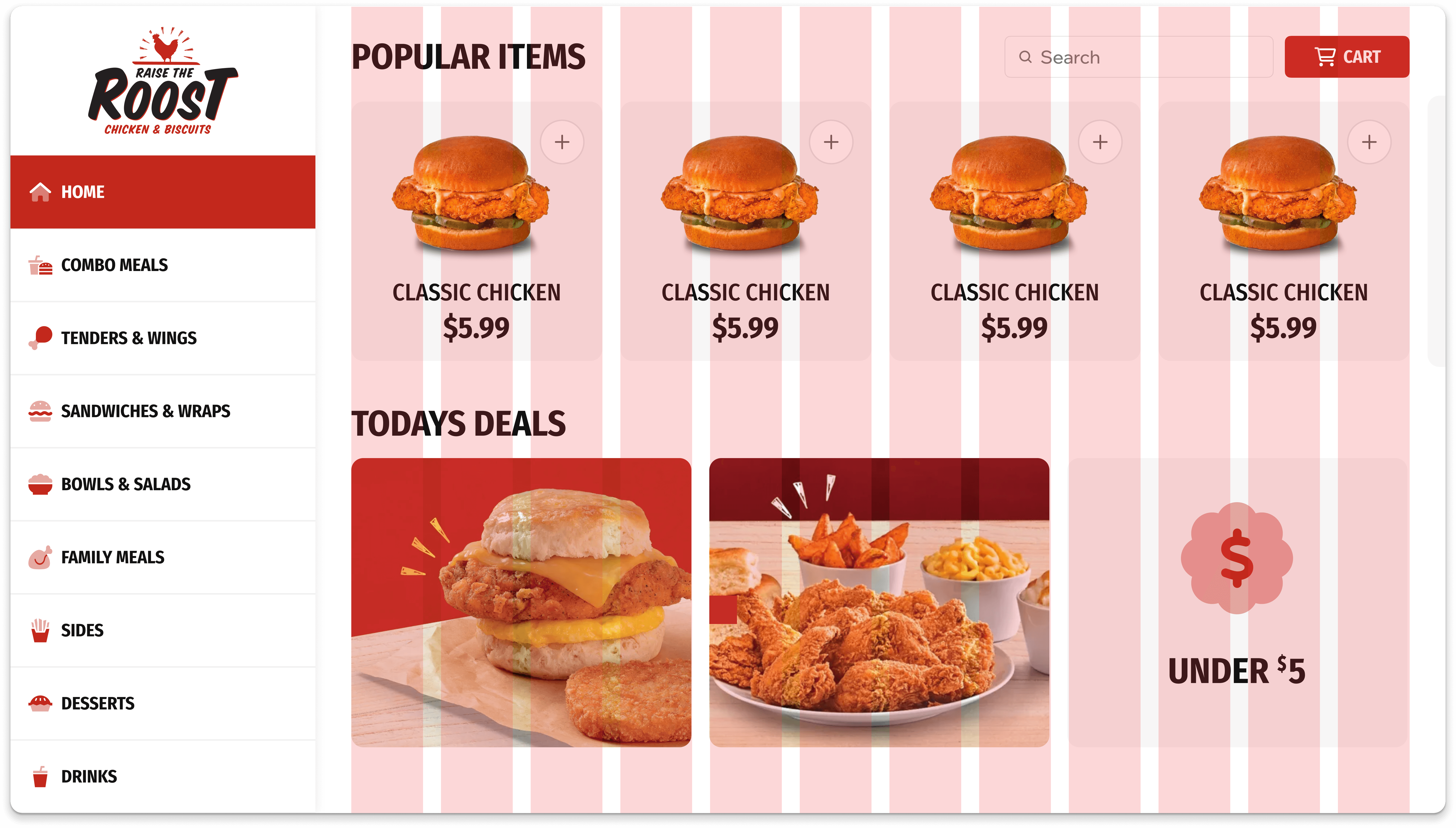
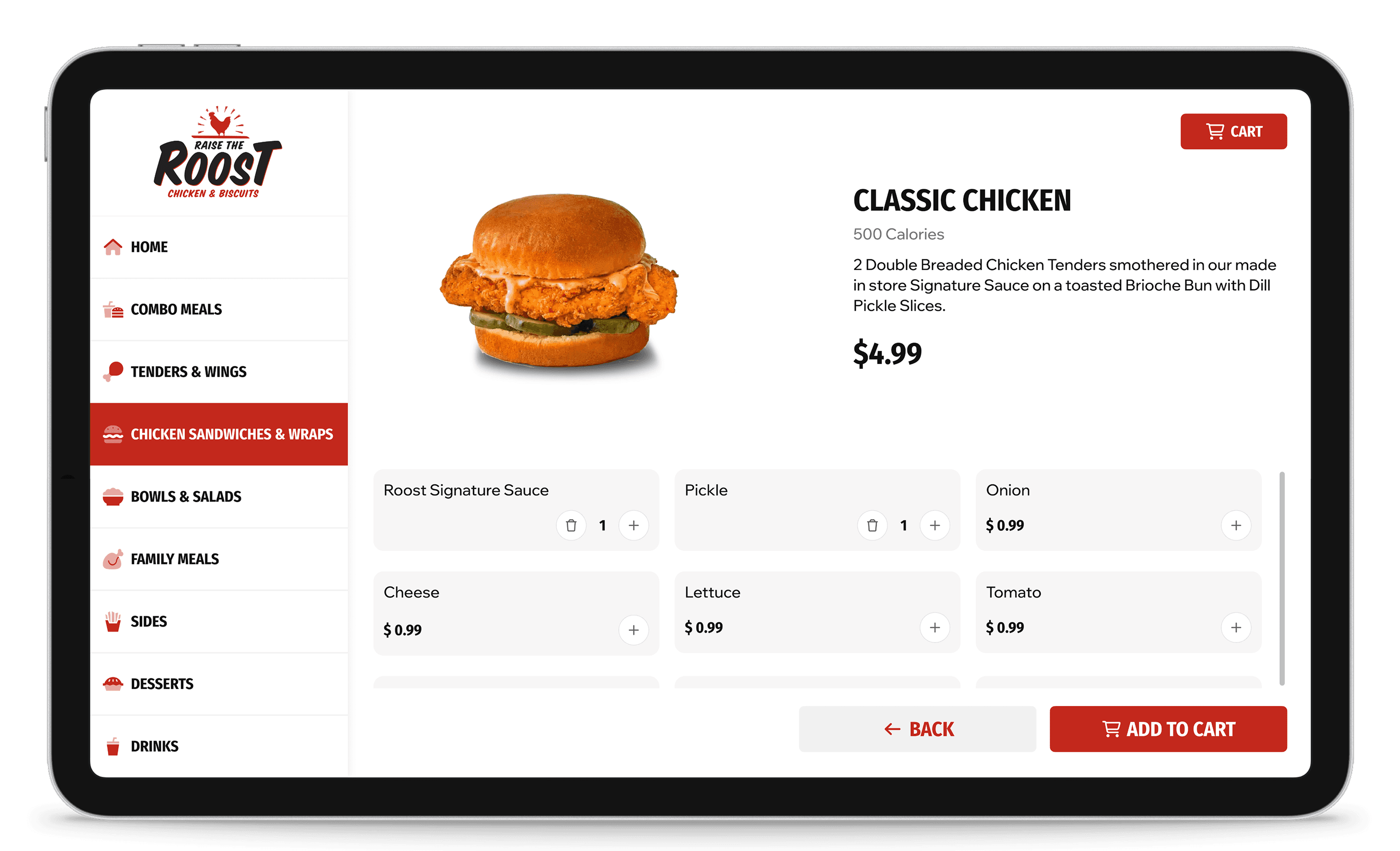
With the home page solved, I started on the product detail page, and product listing page
Working within our Slurpee Design System, I developed several new components specific to the food ordering context. Rather than creating one-off designs, I carefully considered how each new element worked with our broader component library. For instance, core components such as steppers were used instead of building something new. For new components such as the customization panels for adding toppings, I carefully considered how each new element could become part of our broader component library rather than create a one off design.

Slurpee steppers were used throughout the new kiosk design

New components were designed to be reusable across this and future projects
This systematic approach paid off tremendously during implementation.
Development proceeded smoothly because there were no one-off components requiring special attention. There were no unique components requiring additional tech lift, and this consistency significantly reduced the number of design-related questions and blockers.
Thankfully I was able to deliver the new kiosk designs within our tight timeline.
Early data shows reduced time to complete orders. We've also seen an increase in add-on sales thanks to strategic promotion placement. Perhaps most importantly, we've created a system that the new design team can easily maintain and expand upon.
This project reinforced Taking a systems approach to design is always beneficial, but becomes essential under time constraints.
.Leveraging existing design systems and components wherever possible saved countless hours. Building flexibility into interfaces helps accommodate changing business needs without requiring redesigns. Finally, thorough documentation ensures smooth knowledge transfer during team transitions.

Raise the Roost Kiosk
A fast-track UX design project to create an intuitive self-service kiosk interface for a restaurant chain, with the added challenge of a tight timeline and transition between designers.
When our existing designer announced their departure, we found ourselves in a tight spot.
We needed to quickly develop a user-friendly kiosk interface that would streamline the ordering process while maintaining consistency with our design systems. The solution had to be modular, scalable, and implementable within a compressed timeframe.
I started by mapping out comprehensive user flows for the entire customer journey.
This included paths for standard menu ordering as well as custom flows for building meal combinations. By visualizing these journeys early on, we could identify potential friction points and design around them from the start.
Beginning of Basic Order Flow
Beginning of Build Order Flow
Our team gathered for a workshop to analyze the competitive landscape.
We looked at what was already in the market, discussing what worked well and what didn't. Through this collaborative process, we identified pain points in competitor interfaces and documented successful patterns worth adapting.
The good
The bad
And the ugly
We gathered these findings to move forward
We spotted several opportunities for innovation where other kiosks were succeeding, and others were falling short. That led to a gameplan on how to deliver the best MVP in our short timeframe.
I think in systems, so the first thing I did was establish a flexible grid layout for the home screen.
This modular architecture was crucial because it accommodated varying numbers of promotions while allowing components to dynamically resize without losing visual consistency. When the marketing team needed to add seasonal promotions, the interface could adapt without requiring a full redesign.
With the home page solved, I started on the product detail page, and product listing page
Working within our Slurpee Design System, I developed several new components specific to the food ordering context. Rather than creating one-off designs, I carefully considered how each new element worked with our broader component library. For instance, core components such as steppers were used instead of building something new. For new components such as the customization panels for adding toppings, I carefully considered how each new element could become part of our broader component library rather than create a one off design.
Slurpee steppers were used throughout the new kiosk design
New components were designed to be reusable across this and future projects
This systematic approach paid off tremendously during implementation.
Development proceeded smoothly because there were no one-off components requiring special attention. There were no unique components requiring additional tech lift, and this consistency significantly reduced the number of design-related questions and blockers.
Thankfully I was able to deliver the new kiosk designs within our tight timeline.
Early data shows reduced time to complete orders. We've also seen an increase in add-on sales thanks to strategic promotion placement. Perhaps most importantly, we've created a system that the new design team can easily maintain and expand upon.
This project reinforced Taking a systems approach to design is always beneficial, but becomes essential under time constraints.
.Leveraging existing design systems and components wherever possible saved countless hours. Building flexibility into interfaces helps accommodate changing business needs without requiring redesigns. Finally, thorough documentation ensures smooth knowledge transfer during team transitions.