Slurpee Design System

The Slurpee Design system took what started as a single app solution, and evolved into a comprehensive framework that empowers all of 7-Eleven's product development.

The original 7-Eleven design system emerged organically during a redesign of the main consumer app.

The original 7-Eleven design system emerged organically during a redesign of the main consumer app.

As the sole designer responsible for building, maintaining, documenting, and expanding the system, I navigated the challenges of supporting the flagship 7-Eleven app with limited resources. Despite these constraints, the system proved effective enough to demonstrate the value of structured design practices.

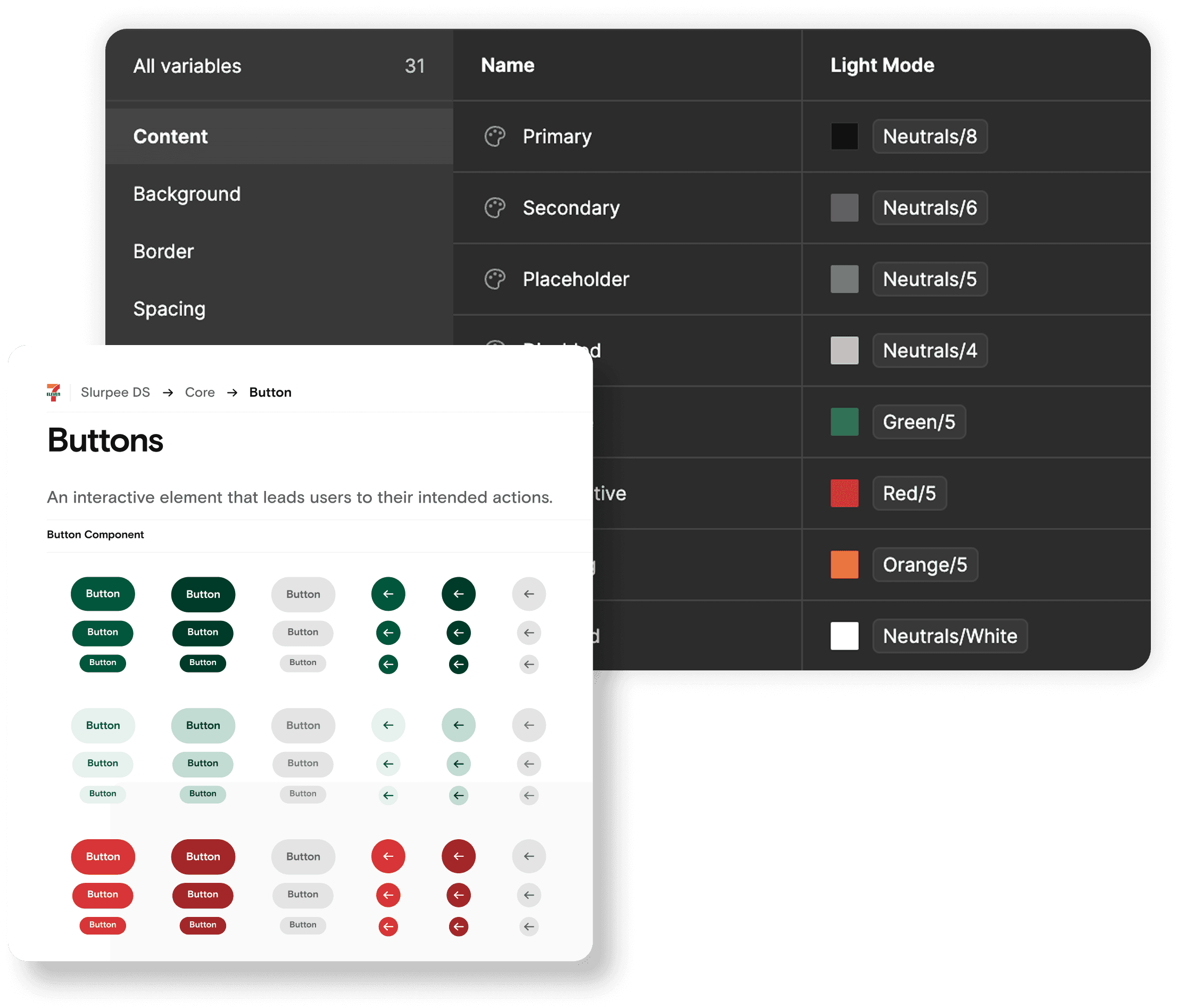
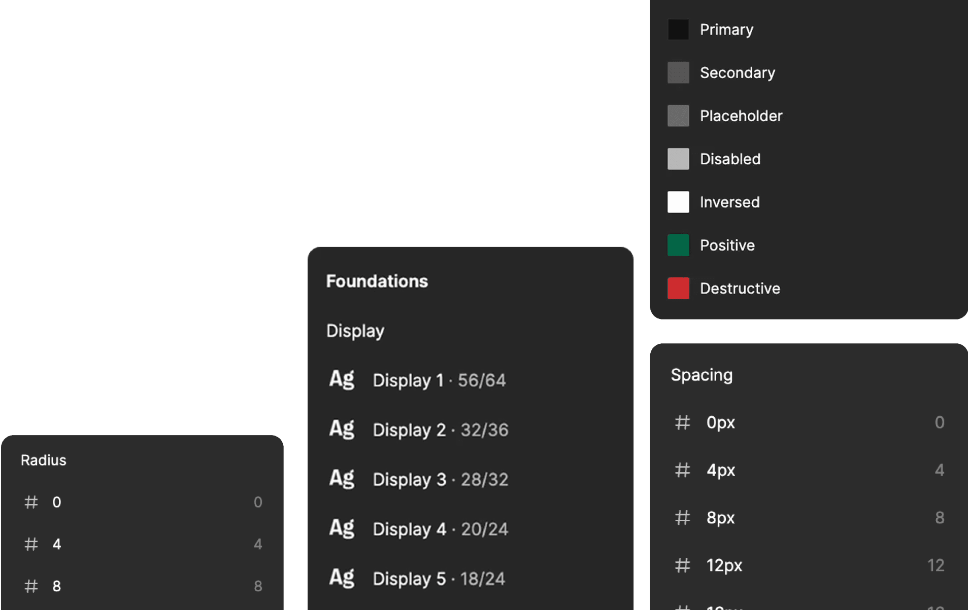
This foundation was established before Figma had introduced crucial features like properties and variables, requiring the creation of numerous component variants to accommodate different states and configurations—a painstaking but necessary approach given the technology limitations of the time.

It was originally built for a single consumer app, but when we tried to scale it across our other digital products, we began to see the gaps in the design system. This led to inconsistent user experiences, duplicated development efforts, and significant maintenance challenges as each application team created their own solutions rather than building on a shared foundation. As a result, both our development velocity and brand consistency began to suffer across platforms.

The core problem with our previous design system was it was its siloed approach.

It was originally built for a single consumer app, but when we tried to scale it across our other digital products, we began to see the gaps in the design system. This led to inconsistent user experiences, duplicated development efforts, and significant maintenance challenges as each application team created their own solutions rather than building on a shared foundation. As a result, both our development velocity and brand consistency began to suffer across platforms.

To build a better design system, we needed to go beyond assumptions

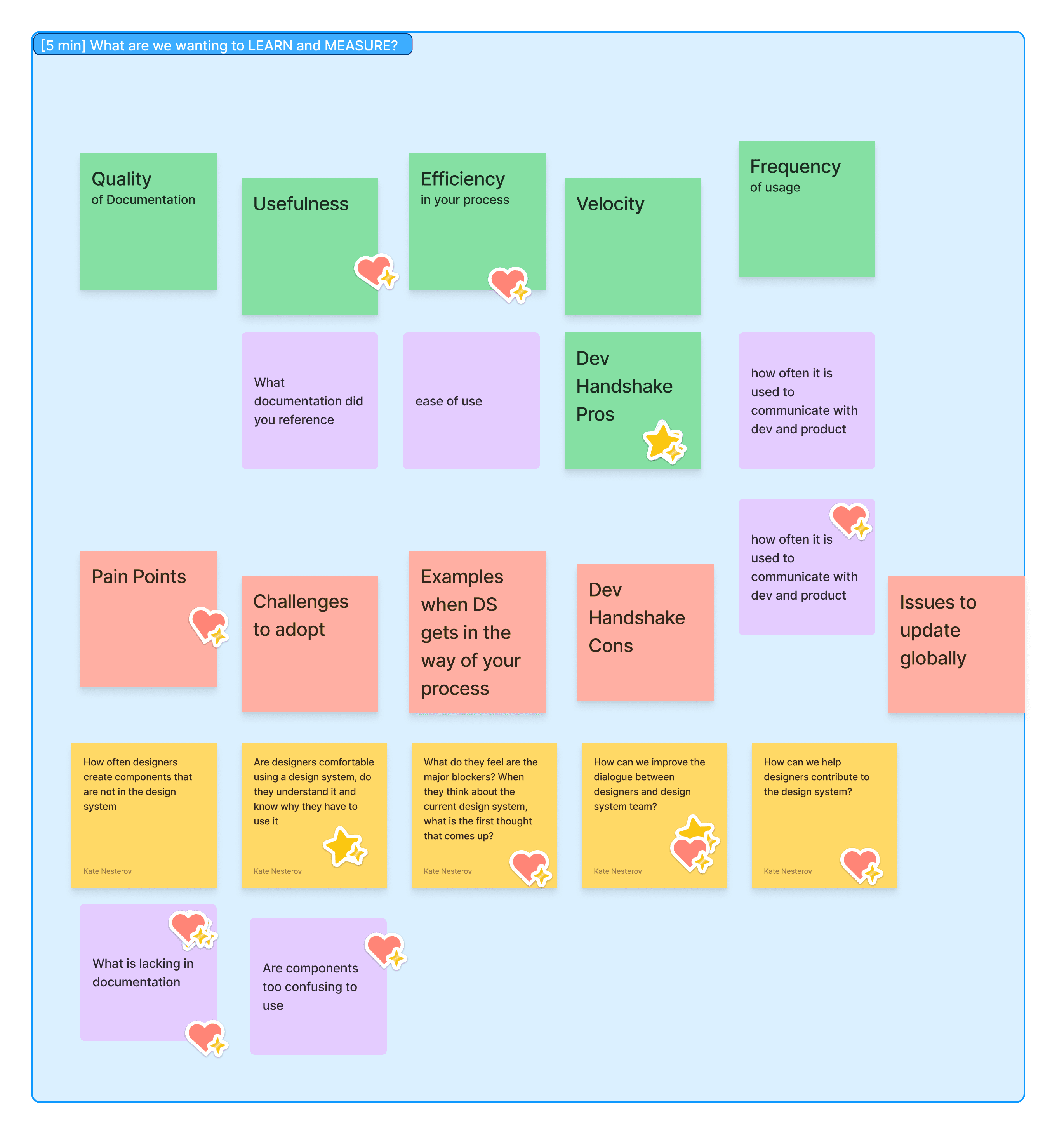
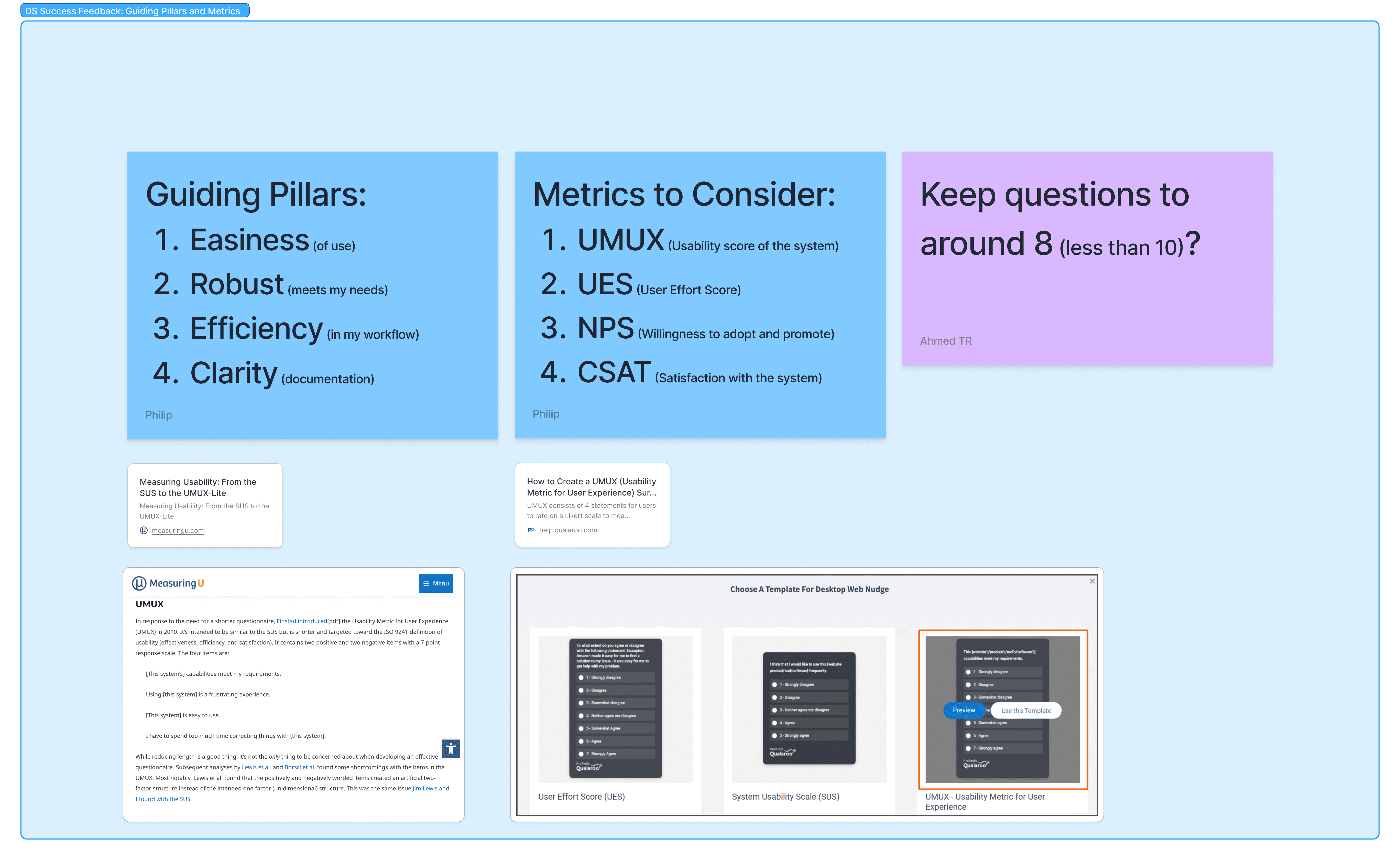
We started with solid assumptions of the current design system's strengths, and weaknesses but we recognized that to deepen our insights, surveys, interviews, and a thorough audit were needed to help us confirm specific areas for improvement that would make the design system truly serve the entire organization

This review revealed three common issues:

  1. Components weren’t usable across all applications

  2. Overly complex components led to library detaches and inconsistencies

  3. Some figma components were unused and were creating library bloat

  4. Bespoke components were built where system components could be used

This confirmed it was time to develop a fresh strategy that would unify our digital ecosystem. We needed an approach that could bridge the gap between consumer and enterprise applications while creating a simpler, more cohesive foundation—one built to scale alongside our organization's evolving needs.

When designing our new design system, we wanted to make it flexible but consistent. Our plan had two main parts:

Core Libraries
We made core libraries as the base of our design system. These include text styles, core components, and icons and assets that everyone can use.

Domain Libraries
Building on this foundation, we created application-specific libraries that pull from core libraries to ensure system-wide consistency. They implement variable theming to adjust critical design elements (colors, spacing, corner radius) to meet product-specific requirements. These libraries also house components unique to a singular application to prevent design system bloat and maintain product-specific UI elements without impacting the core system.

This setup helps our teams keep a consistent brand while having the flexibility for different products. By keeping core design elements separate from app-specific ones, our system grows well and reduces design problems.

When designing our new design system, we wanted to make it flexible but consistent. Our plan had two main parts:

When designing our new design system, we wanted to make it flexible but consistent. Our plan had two main parts:

When designing our new design system, we wanted to make it flexible but consistent. Our plan had two main parts:

Core Libraries
We made core libraries as the base of our design system. These include text styles, core components, and icons and assets that everyone can use.

Domain Libraries
Building on this foundation, we created application-specific libraries that pull from core libraries to ensure system-wide consistency. They implement variable theming to adjust critical design elements (colors, spacing, corner radius) to meet product-specific requirements. These libraries also house components unique to a singular application to prevent design system bloat and maintain product-specific UI elements without impacting the core system.

This setup helps our teams keep a consistent brand while having the flexibility for different products. By keeping core design elements separate from app-specific ones, our system grows well and reduces design problems.

Designers would need to learn new skills so they could take ownership of their specific app libraries.

Our first success was with the Speedway app design system. I trained a designer on how to build components just for that app, using Figma variables.

The designer learned how to create components that fit the Speedway app's unique needs while still connecting to our core design system. By using Figma variables, they could adjust things like colors and spacing without breaking the overall design rules.
This training helped the designer become more independent and gave them more control over their area of the design system. It also showed that our two-layer approach works well in real projects.

This approach meant we needed to have a clear process for adding new components.

We decided that when designers wanted to change or create a component, they filled out a short form. We would meet to review their request and either add it to our backlog or explain why it wasn't needed.

For core components, the design ops team handled the design work. For app-specific components, that app's team did the design. When the design was finalized, we reviewed all components to make sure they followed our design system and met accessibility guidelines. After approval, the component would be published to its library and documented.

Submit Request

Designers formally submit change request

Design Component

If accepted, design team designs component

Quality Check

Component is checked for proper construction and accessibility

Publish Component

Component is documented to respective library

The Slurpee Design System has proven to be a transformative force across 7-Eleven's digital ecosystem, with adoption exceeding our initial expectations.

The success of the system is evident in both new development and legacy application migration.
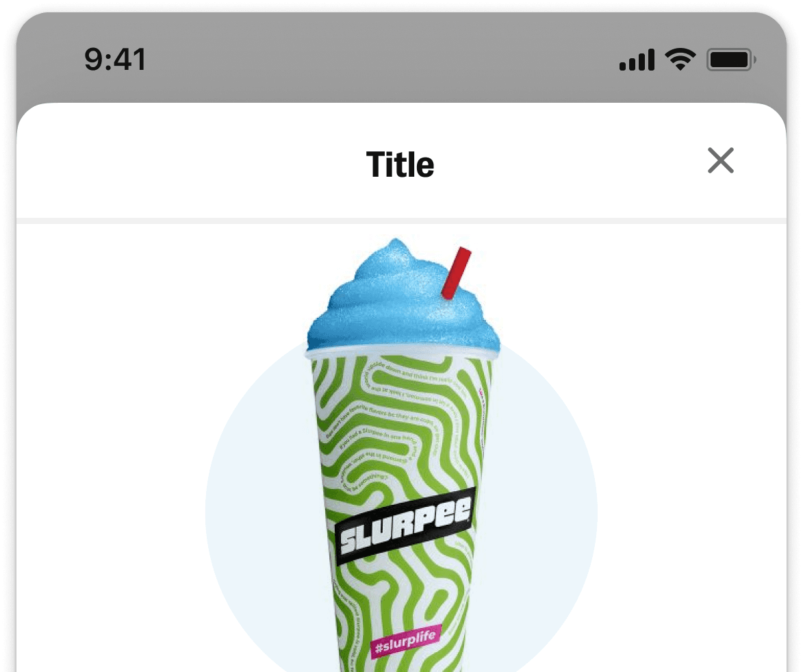
One of our most significant achievements was the Speedway app, built entirely from scratch using our new theming capabilities and component library. This project demonstrated the design system's flexibility and efficiency, allowing the team to launch a polished product in a tight deadline while maintaining visual and functional consistency with our core brand.

Equally important has been the steady transition of existing enterprise products to the new library. What began as skeptical experimentation quickly gained momentum as teams experienced firsthand that our library now addressed different plaforms, and also allowed for indivdual contribution and allowing . Today, the majority of our enterprise applications have either fully migrated or are in the process of adopting the Slurpee Design System.

The simplification of components has been a key driver of this widespread adoption. By reducing complexity and focusing on intuitive patterns, we've seen significantly better adherence to design standards across teams. This improved consistency has not only enhanced the user experience but has also streamlined development processes, reducing time-to-market for new features and applications.
As we look to the future, the Slurpee Design System stands as a testament to how thoughtful design infrastructure can unite consumer and enterprise experiences under one cohesive brand while still addressing the unique needs of each audience. What began as an evolution of a single app's design language has become the foundation for 7-Eleven's entire digital presence, enabling faster innovation and a more consistent experience for all users.RetryP